Imagination Instigation
Monday, November 8, 2010
Symmetric Balance
The tree design in this picture (and not anything else) has symmetric balance because the two halves mirror each other. This characteristic allows the picture to be cut in half and have both halves show the same thing.
Asymetric Balance
The design of this ad for Honda has asymmetrical balance because the space is evenly used yet the two halves do not mirror each other.
Wednesday, October 27, 2010
Scale (with Relation to Proportion)
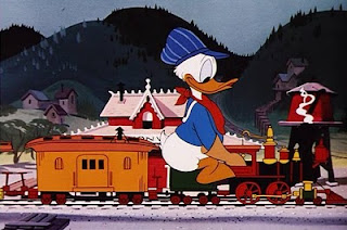
In this picture, Donald Duck is out of scale with the rest of the scene. Because the scale is not proportionate, Donald Duck appears to be too big, which can make him seem out of place.
In this picture, Mickey Mouse and Donald Duck have been made to scale with the train, which puts them in harmony with the scale of the train.
*these pictures show that you can find scale and proportion in just about anything, if not everything, in life
In this picture, Mickey Mouse and Donald Duck have been made to scale with the train, which puts them in harmony with the scale of the train.
*these pictures show that you can find scale and proportion in just about anything, if not everything, in life
Proportion Representation
The proportion in this picture is evenly balanced, creating five even points on the star.
Each extension is equal to all the others, making it not only proportionate, but symmetric as well.
Each extension is equal to all the others, making it not only proportionate, but symmetric as well.
Tuesday, October 19, 2010
An Example of Hierarchy
The Hierarchy of this picture starts with the focal point, which is the picture of the man and bear. The eye then moves to the headline of the magazine, "Outdoor Life", then the headlines in the yellow box, "Soviets Welcome..." etc. until, finally, the eye notices the less impressive words in the upper right hand corner of the cover, "Special: New Boats and Motors."
Monday, September 13, 2010
Principles of Design Assignment - Unity
This illustration of an orchestra shows the characteristics of unity. All of the members are wearing uniform, and are drawn in the same style.
Principles of Design Assignment - Variety
This living room idea from iKea shows the characteristics of variety. It includes various stripes, circles, and squares.
Subscribe to:
Comments (Atom)


